NAFDA Cover Art
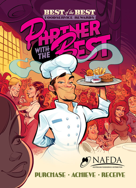
Here's some cover art illustration and design for a food industry trade magazine (NAFDA - through my agency, The Drawing Book):

Below is the Sketching process, for those interested:
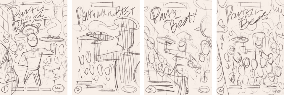
The brief was to draw a chef as a hero character walking through a busy function room with a plate of food. So I drew up four quick thumbnail rough variations.
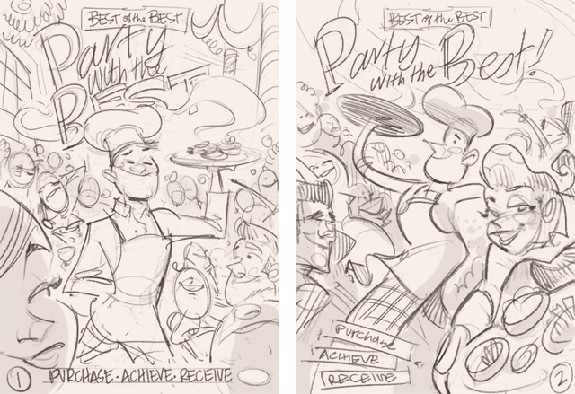
I showed these to my agent, Matt, and he advised I whittle it down to two and render them a little tighter, so I progressed to these, below:
The client liked thumb 1, so I took another pass at it, with a couple of revisions...
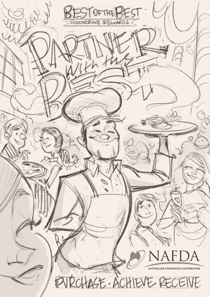
I kept this rough, too, as I wanted to make sure the client was happy with the general layout before I spent too much time on the more polished sketch (below):
This was approved. The grey area on the edge is the bleed - a massive amount for a published piece, but I guess it gives them some play in the final design. I inked and coloured digitally, and supplied the finished art, as seen at the top of the post.
Keen observers will notice that in the sketches, the chef is wearing an apron. This was changed along the way to reflect a more accurate uniform.
The art was drawn at the end of last year, and just recently I've finished the 'sequel': a summer variant, which I will share on publication towards the end of the year.
Thanks for stopping by!
~ Anton


