Fuji Xerox Hulk
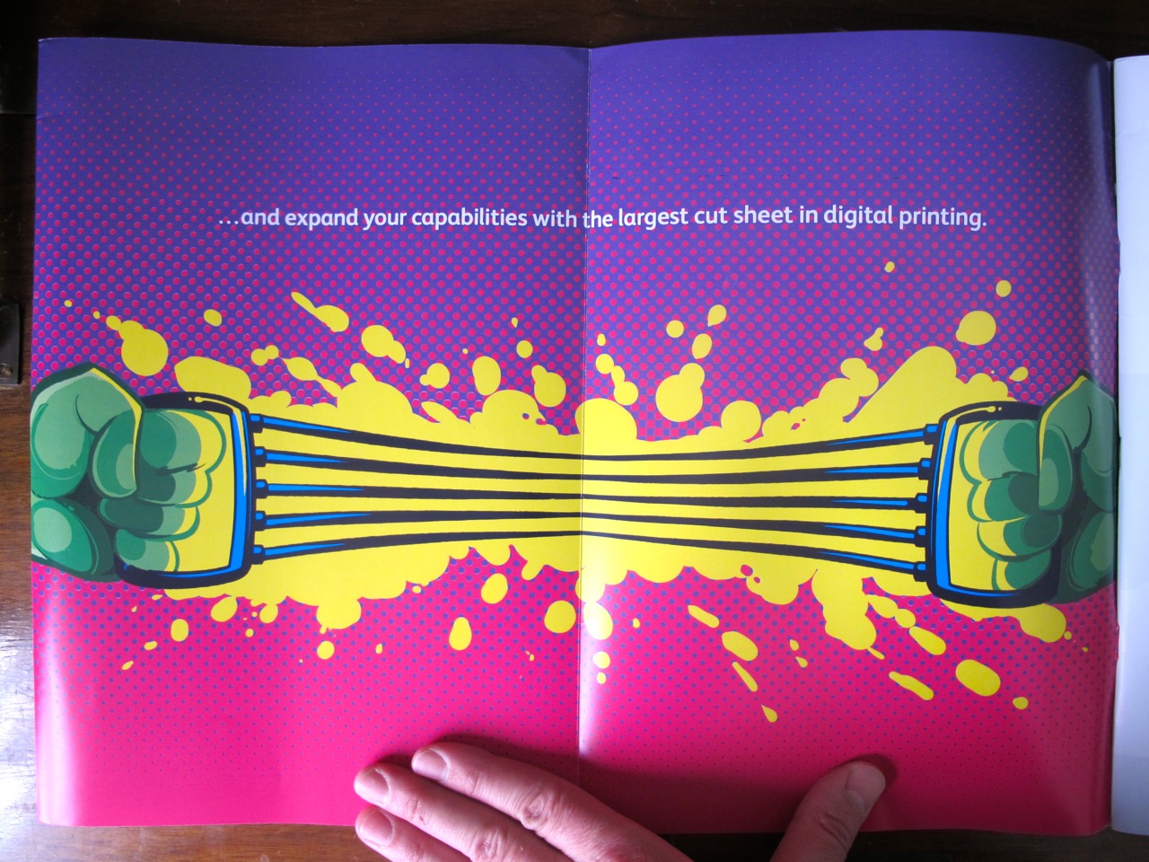
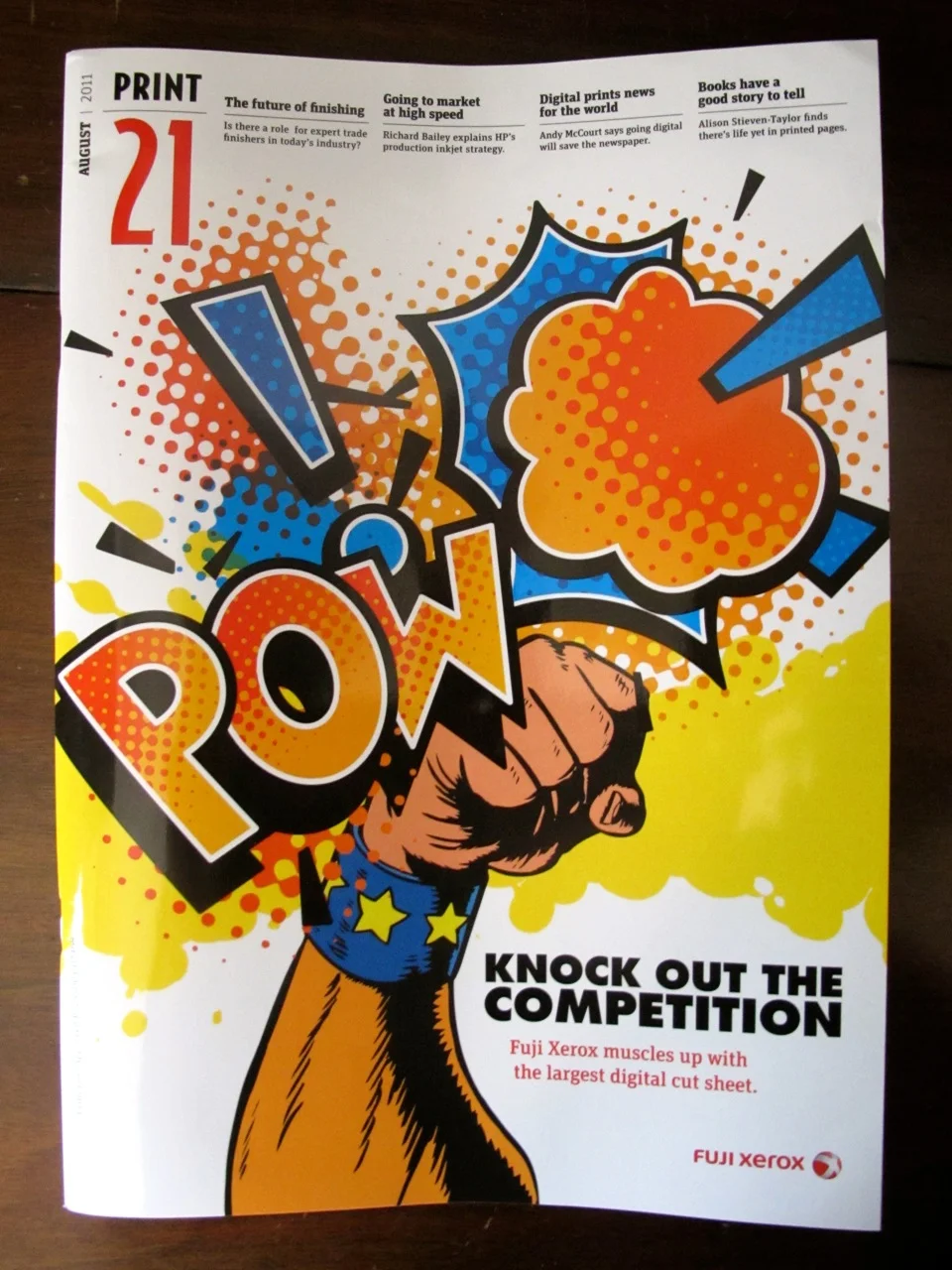
Here's a fun illustration I drew for a Fuji Xerox print ad, published in Print 21.

Talented designer Daniel Poskitt called up, and we turned this around within 24 hours!
Here's how the actual ad looks in the mag...
And some of the process. below. There were a lot of colour variations and background treatments which I haven't included, but basically we went from springs to rubbery, and then the current, modern chest expander. I was very pleased that they ran with my green suggestion, and even changed the ad line to match it.
Thanks for stopping by!


