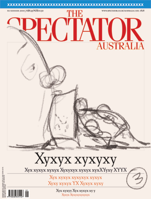
Free Speech Cover Art
This week's cover art for The Spectator Australia focuses on the free speech debate instigated by the recent Andrew Bolt trial. In his article, George Brandis focuses more on the media's reaction and the bigger picture of journalism and the right to opinion - politically correct or not. Please click all images for a closer view...
The Process
Thumbnails
Quick turnaround on this one, so I came up with three thumbs, but only two concepts: thumbs 1 and 2 are variations on the same theme (Editor's direction: "Focus more on judicial puritans and less Bolt"), while thumb 3 is a little different.
The editor liked both #1 and #3, and let me decide which I'd like to draw. I felt like cracking out the brush and ink, and thought that #1 would make for a nice, loose inked illustration. Also, having the figures peeking over the masthead can help readers pick up the mag in the newsagent - something to consider.
Sketches and Roughs
I worked up the sketch a little digitally to make sure it worked in the space, and then used my screen as a lightbox to trace onto paper. (As colleague Luke Watson noted, the Wacom Cintiq is the most expensive lightbox ever!)
So then I draw the sketch up on paper and scan it back in, adding a light wash and inserting it into the template. I've kept it nice and loose so I don't lose the energy in the inking.
Inks
I drew this using a Winsor Newton Series 7 #2 brush and india ink. As it's going to be touched up a little after scanning, I don't worry too much about a few bum lines... I just try to do it as fast as possible to keep up with the deadline.
As you can see, I added a few ink splatter up the top right to use as background spatter and texture.
Colour
So I scan the inks into Photoshop, clean them up a bit, and drop in a flat colour underneath, plus some ground.
I also want a dry brush background, so I get the old brush pen out, and using a watercolour, rougher paper I draw up some outlines that I can scan and use:
And the next step is do colour the different areas. I try not to use too many different colours here...
And then I select the colour areas and add a bit of shading to bring it to life. With strong linework, it's best to keep the colours flatter, rather than heavily toned... so I just give it a pretty light wash, adding subtle texture and spatter to the background. Please see finished art, below. Please click for a closer look.
And the published cover, below:
Thanks for looking!
Anton


