Modern Dentistry
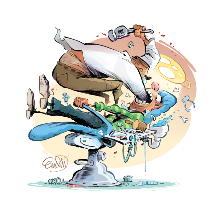
Here's a fun spot illustration for The Weekly Standard magazine illustrating Matt Labash's toothy tale of terror with a student dentist.
Drawn with brush and ink on watercolour paper for a loose look, then scanned for digital colour. (Please clicky-click the images for a larger view.)
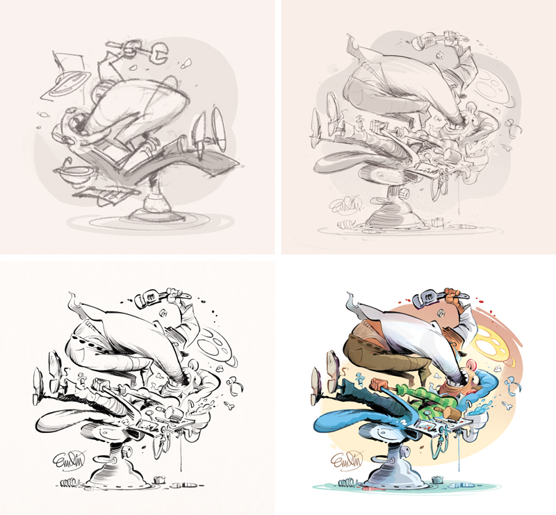
Here's a really quick process for you. Basically, it starts digitally where I draw the quick thumbnail rough, and then proceed to a tighter sketch. I do this all in Photoshop. Then, after printing it out I tape the sketch to the back of some paper, and ink it over a lightbox using brush and india ink and a couple of pens here and there. Then I scan it back in, touch it up a little, and splash on some colour!
You can read the article online here, or if you're in the States, grab the current issue at your favourite newsstand.
Thanks for looking,


